Nexus Juris Chambers is a forward-thinking law firm that combines traditional legal expertise with innovative thinking. With a focus on strategy, clarity, and strong legal frameworks, the firm offers comprehensive legal solutions to clients across corporate, civil, and regulatory matters.
Project Overview
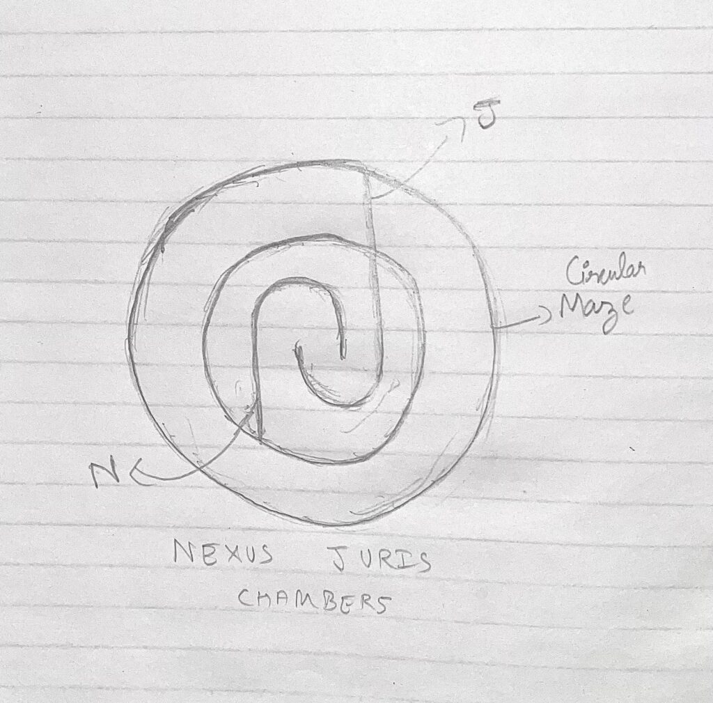
The client approached us with a unique and symbolic vision — to design a logo that visually reflects complexity, logic, and order, much like the practice of law itself. Their specific request was for a circular maze, a representation of navigation, problem-solving, and legal strategy. Our task was to merge this concept with the identity of the firm.
Design Goals
Identity Fusion
Bold Sophistication
Memorability
Structure Symbolism
Ideation
&
Sketching
Logo Concept & Symbolism
This logo brings intricate meaning to the forefront of visual branding:
Circular Maze Structure: The logo forms a three-layer circular maze — symbolizing strategic thinking, legal complexity, and intelligent pathways to solutions.
Infused ‘N’ and ‘J’ Initials: At the heart of the maze lie the letters ‘N’ and ‘J’, creatively woven together. The ‘N’ begins from the end of the maze and transitions into a ‘J’ at the top, reflecting connection and progression — core values in law.
Central Balance: The initials are integrated in the innermost layer, emphasizing focus and precision in legal counsel.
Color Story
#1F2839 Charcoal Blue
/ 1
Represents power, authority, and depth — a foundation color ideal for a law firm.
#B69D74 Muted Gold
/ 1
Adds a sense of prestige, sophistication, and timeless quality, giving the logo an elite finish.
Typography Choices
Allerta Stencil
(Primary Font): A geometric and modular typeface that echoes the structured maze-like motif of the logo. Its stencil appearance adds a commanding presence while still appearing modern and readable.
ABCDEFGHIJKLMNOPQRSTUVWXYZ
ABCDEFGHIJKLMNOPQRSTUVWXYZ
1234567890
Design Rationale
The Nexus Juris Chambers logo is a refined fusion of form and function. It showcases the essence of legal navigation and interconnected thinking through the maze design, while anchoring the firm’s identity with the bold integration of initials.
The typography complements the maze’s technical aesthetic, and the luxurious color scheme solidifies the brand’s premium positioning. The result is a logo that is intellectually engaging, visually distinct, and professionally resonant.
Final Outcome
The logo has become the cornerstone of Nexus Juris Chambers’ brand presence — appearing on letterheads, legal documentation, digital platforms, and office signage. It not only communicates the firm’s sophistication and strategic capability but also leaves a memorable impression of professionalism and depth.
Through this design, Nexus Juris Chambers projects a visual identity as precise and commanding as their legal expertise.