Bloody Sweet is a cafe brand that combines bold flavors with a quirky personality. Inspired by street-style indulgence and comforting desserts, the cafe offers a distinctive blend of sweet and savory treats. The name itself represents contrast — intense and delicious — making it a unique identity in the food and beverage space.
Project Overview
The client approached us with a unique brand name and a clear desire for visual storytelling. They wanted a logo that would represent indulgence, boldness, and approachability while appealing to both youth and food lovers. The identity had to look fun, slightly rebellious, and irresistibly sweet — all at once.
Design Goals
Memorability
Abstract Imagery
Typographic Integration
Playful Representation
Ideation
&
Sketching
Logo Concept & Symbolism
The logo brings together clever design and narrative symbolism:
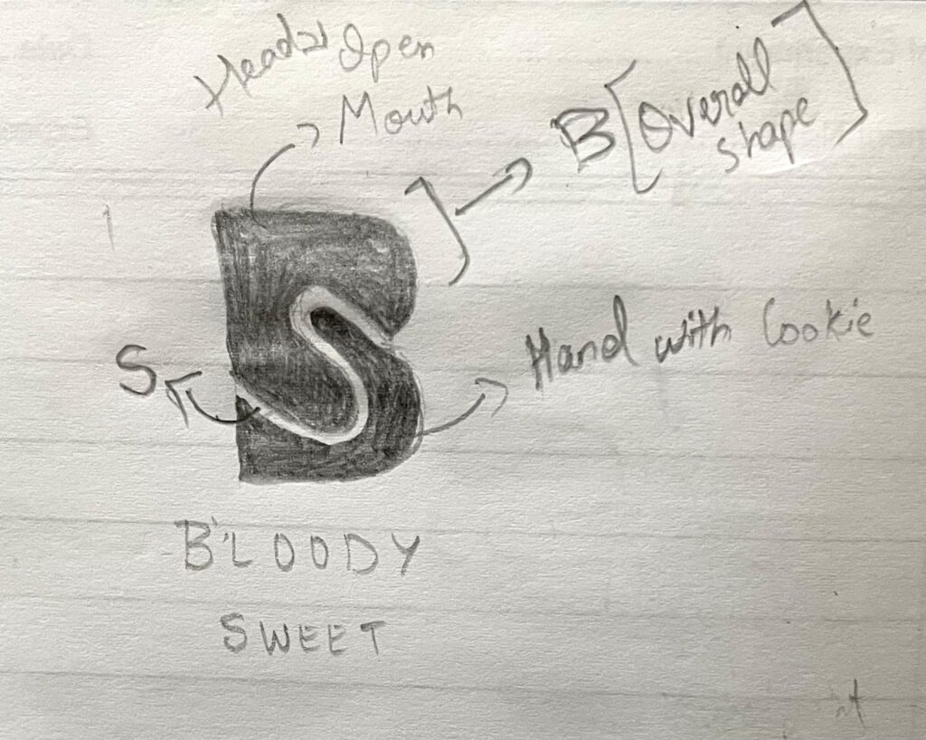
Hidden Initials (‘B’ & ‘S’): The main structure uses the letter ‘B’ as a base, split within by an ‘S’ shape, which stands for “Sweet.” This duality symbolizes the fusion of boldness and sweetness — the brand’s central identity.
Eating Gesture Visual: The overall form of the logo resembles a person opening their mouth and taking a bite, with an arm reaching out to eat a cookie. This adds a playful, food-centric, and human touch to the visual.
Quirky Abstraction: The icon doesn’t literally depict food but evokes it through form, encouraging recognition through imagination — perfect for a brand that thrives on personality.
Color Story
#D32F2F Bold Red
/ 1
Symbolizes intensity, appetite, and energy. A color commonly associated with food cravings and passion.
#4B2E2A Choco Brown
/ 1
Adds depth, warmth, and evokes feelings of richness and chocolatey sweetness.
Typography Choices
RED Peppers
(Primary Font): A bold, cheeky typeface that adds character and flair to the main wordmark. Perfect for branding that wants to make a statement.
ABCDEFGHIJKLMNOPQRSTUVWXYZ
ABCDEFGHIJKLMNOPQRSTUVWXYZ
1234567890
Choco Belgium Demo
(Secondary Font): A smooth and soft script-style font that adds a dessert-like fluidity and a handcrafted feel, making it inviting and friendly.
ABCDEFGHIJKLMNOPQRSTUVWXYZ
ABCDEFGHIJKLMNOPQRSTUVWXYZ
1234567890
Design Rationale
This logo balances fun, appetite, and clever design. By integrating brand initials into a symbolic eating gesture, it creates a strong mental link to the café’s purpose. The rich color palette and bold type further anchor the branding in food and flavor, while keeping it visually distinct and engaging. The harmony of the fonts and forms makes it both playful and professional.
Final Outcome
The Bloody Sweet logo has been successfully implemented across the cafe’s storefront signage, menus, merchandise, and digital platforms. It stands out in a saturated café market, providing strong recall and emotional engagement. The visual storytelling enhances the café’s mission to serve bold treats with a sweet twist — every bite, bloody sweet.