Bold Steps Foundation is an educational NGO committed to empowering women and children through education, support, and opportunities. The organization works to create a safe, nurturing space where beneficiaries can take meaningful steps toward a brighter future.
Project Overview
The foundation approached us with a clear mission — to design a logo that reflects their core values of empowerment, compassion, and progress. The brand identity needed to resonate emotionally with the audience while maintaining a professional and trustworthy tone.
Design Goals
Inclusivity
Empowerment
Symbolism
Emotional Connection
Ideation
&
Sketching
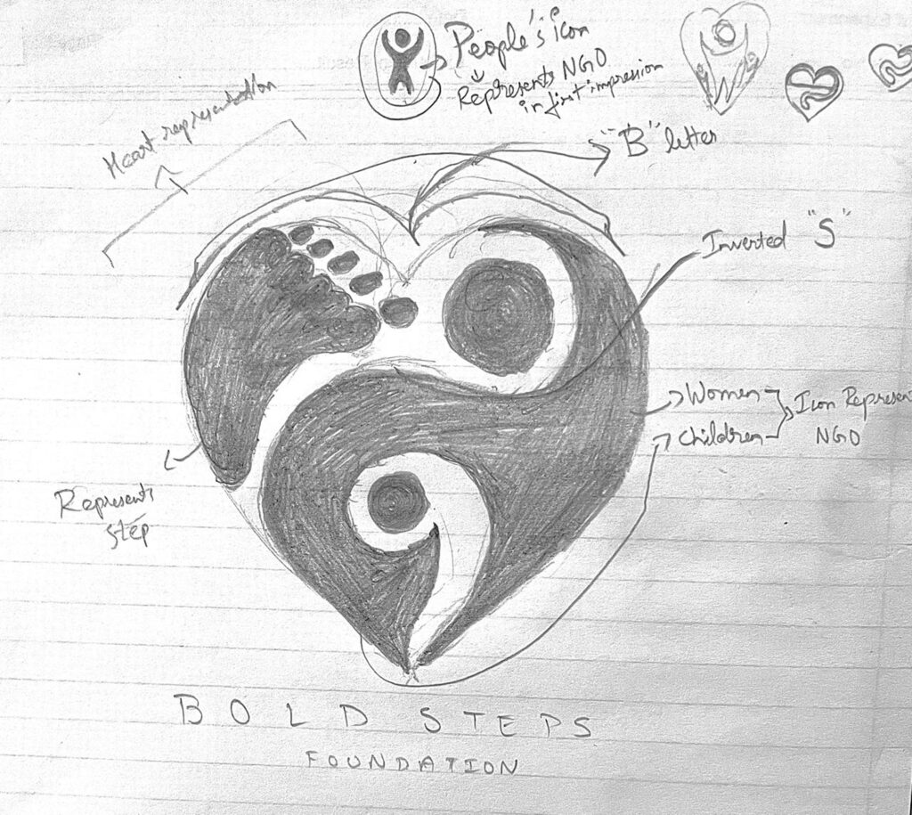
Logo Concept & Symbolism
The final logo brings together thoughtful visual elements that tell a unified story:
Heart Shape: The foundation of the design, representing love, care, and unity — the very core of the NGO’s mission.
Human Figures: Two simplified icons within the heart — a larger figure representing women and a smaller one representing children, emphasizing inclusivity and guidance.
Footstep Mark: A subtle footprint symbol reflects the name Bold Steps, showcasing growth, progress, and forward momentum.
Hidden Initials (‘B’ & ‘S’): The upper part of the heart subtly forms a ‘B’, and an inverted ‘S’ is cleverly embedded within. This creates a unique identity without compromising clarity.
Color Story
#00274D Navy Blue
/ 1
Symbolizes trust, professionalism, and grounded support. It forms the structural backbone of the logo.
#FFC0CB Soft Pink
/ 1
Evokes warmth, care, and a nurturing environment, adding emotional softness to the overall brand.
Typography Choices
Playfair Display
(Primary Font): A classic serif font that conveys elegance, heritage, and authority. It helps position the NGO as reliable and mission-driven.
ABCDEFGHIJKLMNOPQRSTUVWXYZ
ABCDEFGHIJKLMNOPQRSTUVWXYZ
1234567890
Montserrat
(Secondary Font): A modern sans-serif font that brings clarity, friendliness, and approachability. It ensures legibility and maintains a clean visual flow across brand materials.
ABCDEFGHIJKLMNOPQRSTUVWXYZ
ABCDEFGHIJKLMNOPQRSTUVWXYZ
1234567890
Design Rationale
This logo design strikes a careful balance between meaning and minimalism. Universally recognizable shapes like the heart and footstep anchor the visual identity, while the hidden letterforms build brand memorability. The color palette supports emotional depth and trustworthiness, and the typefaces reinforce both sophistication and accessibility.
The end result is a timeless logo that captures the essence of the Bold Steps Foundation — caring, empowering, and dependable.
BOLD STEPS
FOUNDATION
Final Outcome
The logo has been successfully applied across the foundation’s website, print materials, social media, and outreach campaigns. It not only enhances their visual presence but also strengthens their emotional connection with their audience.
The Bold Steps logo now serves as a proud visual flag for the organization’s ongoing mission to uplift women and children — one bold step at a time.