Claimskart is an insurance reclaiming company focused on helping individuals and businesses retrieve unclaimed or delayed insurance settlements with ease and efficiency. The brand is positioned as a reliable and accessible partner in navigating insurance complexities, turning unclaimed policies into tangible gains.
Project Overview
The client approached us with a vision to create a clean, powerful, and minimal logo. They wanted the brand identity to feel confident and recognizable—something that would stand alongside timeless wordmark logos like Nike or Adidas. A key request was to keep the design centered around the name “Claimskart” itself, with a symbolic touch that resonates with security and reassurance.
Design Goals
Minimal Identity
Trust & Protection
Modern Elegance
Tagline Integration
Ideation
&
Sketching
Logo Concept & Symbolism
Though the logo is minimal, it incorporates thoughtful symbolism to elevate the design:
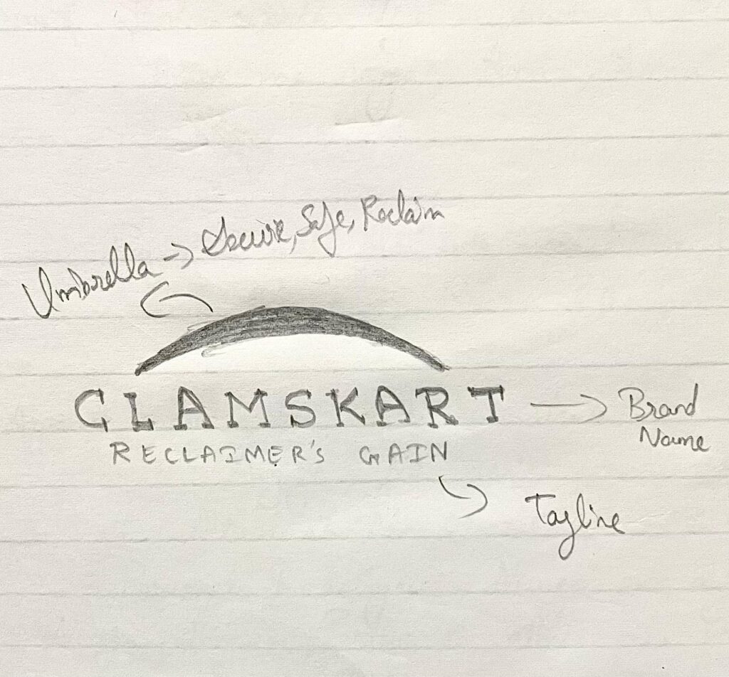
Umbrella Icon: Placed directly above the brand name, the umbrella symbolizes protection and assurance — fundamental qualities in the insurance reclaiming space. It subtly reinforces the idea that Claimskart has its customers covered.
Typography-First Design: The brand name Claimskart is the hero element. The clean structure and precise spacing give it bold visibility and memorability.
Tagline Placement: “RECLAIMER’S GAIN” is neatly placed below, emphasizing the purpose and outcome of the service — every client’s gain is the brand’s promise.
Color Story
#E60012 Primary Red
/ 1
A vibrant and strong shade of red symbolizing urgency, energy, and action. It aligns with the idea of reclaiming what’s rightfully yours with confidence.
#005B4F Secondary Teal Green
/ 1
Represents stability, protection, and reassurance. It anchors the logo in a sense of professional calmness.
Typography Choices
Perpetua
(Primary Font): A classic serif font that embodies sophistication and authority. Its elegant curves add a formal tone, reinforcing credibility.
ABCDEFGHIJKLMNOPQRSTUVWXYZ
ABCDEFGHIJKLMNOPQRSTUVWXYZ
1234567890
Source Sans Pro
(Secondary Font): A modern sans-serif typeface used for the tagline to keep the text clean and legible. It creates a strong visual balance against the more ornamental Perpetua.
ABCDEFGHIJKLMNOPQRSTUVWXYZ
ABCDEFGHIJKLMNOPQRSTUVWXYZ
1234567890
Design Rationale
The Claimskart logo is a modern minimalist mark that reflects the brand’s straightforward and focused approach. It builds trust through timeless typography and underscores its mission through symbolic yet unobtrusive design elements. The subtle umbrella icon adds a meaningful layer without distracting from the name itself.
The two-typeface pairing creates a clear hierarchy, and the red-teal combination ensures both energy and reliability are visually conveyed. The result is a sleek, scalable logo that’s instantly recognizable across digital, print, and advertising platforms.
Final Outcome
The Claimskart identity has been effectively rolled out across web platforms, app interfaces, and printed materials. Its clarity and versatility make it highly functional across formats, while its minimal structure ensures long-term relevance.
With this brand identity, Claimskart confidently positions itself as a modern-day insurance companion — simple, secure, and user-first.