HALLUIN STEEK HOUSE is a premium steak house that specializes in serving high-quality grilled meats in an ambiance that’s bold, fiery, and unmistakably indulgent. Their mission is to blend culinary excellence with powerful branding that ignites curiosity and appetite at first glance.
Project Overview
The client approached us with a striking vision — to design a logo that doesn’t just represent a steak house, but visually captures the essence of flame-grilled perfection. They wanted the brand to feel hot, bold, and intense, while staying creative and memorable.
Design Goals
Visual Flame Identity
Typographic Creativity
Brand Symbolism
Bold Presence
Ideation
&
Sketching
Logo Concept & Symbolism
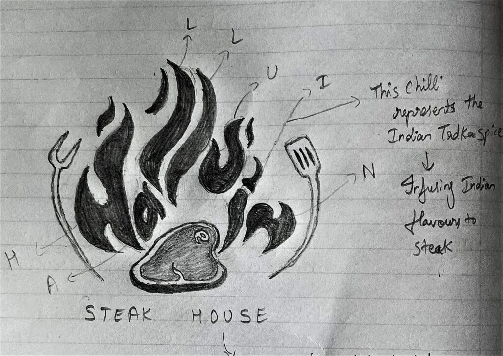
The logo structure tells a vivid culinary story:
Flame Text (HALLUIN): Each letter is shaped like a flame, instantly conveying fire and heat — core elements of a steak house brand identity.
Red Chilli ‘i’: The letter “i” in HALLUIN is designed as a red chilli, representing Indian spices and flavor infusion. This element adds a regional twist, suggesting a fusion of classic steak house vibes with bold Indian “tadka” — an unmistakable nod to the spice-lovers’ palate.
Central Steak Icon: A realistic vector illustration of a steak is positioned under the flames, symbolizing the hearty offering and culinary centerpiece.
Cutlery Elements: A grilling fork and a steak knife flank the steak on both sides, indicating craftsmanship, preparation, and tradition.
Bottom Text (STEEK HOUSE): The tagline grounds the composition and clearly communicates the business category.
Color Story
Gradient from #FFD700 to #FF4500
/ 1
Used in the flame-text “HALLUIN” to represent heat, excitement, and the live fire experience of grilling.
#C22E2A Burnt Red
/ 1
Adds depth and spice, creating a rich steak-like association.
#FEDCC3 Cream Beige
/ 1
Softens the bold tones, offering balance and a touch of warmth.
#CC2F3D Crimson Red
/ 1
Evokes richness and indulgence, perfect for gourmet dining.
#000000 Black
/ 1
Grounds the logo, bringing contrast and professionalism.
Typography Choices
Ketoprak
(Primary Font): The bottom tagline “STEEK HOUSE” is rendered in clean, bold letterforms to ensure readability while contrasting the decorative fire-font above.
ABCDEFGHIJKLMNOPQRSTUVWXYZ
ABCDEFGHIJKLMNOPQRSTUVWXYZ
1234567890
Design Rationale
This logo masterfully combines custom typography, symbolic illustration, and balanced composition. The flame-text adds excitement and uniqueness, while the steak and cutlery drive clarity. The inclusion of the red chilli detail reinforces cultural identity and brand storytelling. It evokes smell, taste, and heat — offering a full sensory preview of the dining experience.
The blend of warm gradients, powerful reds, and black anchoring ensures the logo stands out in both print and digital formats. Whether it’s signage, aprons, or menus, the logo adapts confidently.
Final Outcome
The final logo for HALLUIN STEEK HOUSE serves not just as a brand identity, but as a visual flavor bomb. It captures the fire, passion, and indulgence of a true steak house while remaining iconic and functional.
It now proudly marks the front of the restaurant, their digital presence, and packaging — building a strong brand recall for every sizzling moment shared at HALLUIN.