India on a Plate is a vibrant restaurant concept that fuses the traditional flavors of Indian cuisine with modern dining sensibilities. Rooted in cultural pride, the brand celebrates the country’s culinary heritage while providing a visually immersive and emotionally resonant experience.
Project Overview
The client approached us with a unique goal — to create a logo that instantly screams India while also representing food and hospitality. They wanted an identity that harmoniously blends tradition and creativity, evoking a sense of national pride and delicious anticipation in every viewer.
Design Goals
Cultural Symbolism
Versatility
Fusion of Food & Heritage
Memorable First Impression
Ideation
&
Sketching
Logo Concept & Symbolism
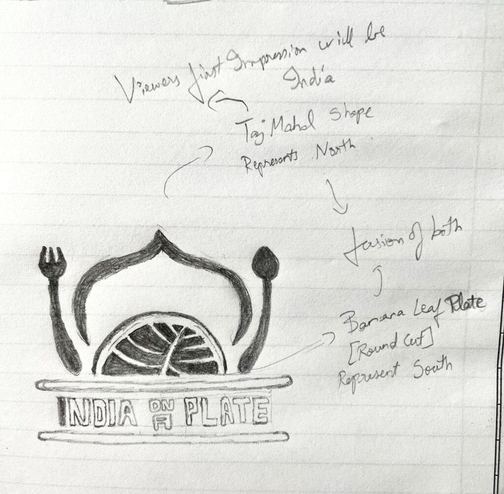
The final logo is a tribute to Indian culture and cuisine, captured in a creative silhouette that draws immediate recognition:
Taj Mahal Form: The overall structure of the logo mimics the shape of the Taj Mahal — one of India’s most iconic monuments, evoking national identity at first glance.
Banana Leaf Plate: Instead of the traditional door of the Taj Mahal, a half banana leaf symbolizes traditional South Indian serving practices — connecting history with food.
Cutlery Pillars: A fork on the left and a spoon on the right replace the Taj Mahal’s pillars — subtly integrating modern dining elements into the classic form.
Brand Name Base: “India on a Plate” forms the strong foundation of the logo, acting like the base of the Taj Mahal and grounding the design with typographic weight.
This fusion of architecture, culture, and cuisine ensures the logo is not just seen, but felt.
Color Story
#800020 Burgundy
/ 1
Represents royalty, richness, and classic Indian decor.
#FF8C00 Saffron Orange
/ 1
Symbolizes festivity, spice, and warmth.
#FFE082 Golden Yellow
/ 1
Captures vibrancy, light, and culinary indulgence.
#4CAF50 Leaf Green
/ 1
Reflects freshness and nature, inspired by the banana leaf.
#FCE7C7 Creamy Beige
/ 1
Balances the palette with subtlety and softness.
Typography Choices
Antonio
(Primary Font): A bold, condensed typeface that lends stature and impact to the brand name, ensuring readability across media.
ABCDEFGHIJKLMNOPQRSTUVWXYZ
ABCDEFGHIJKLMNOPQRSTUVWXYZ
1234567890
Squada One
(Secondary Font): A geometric sans-serif with modern curves that complements the architectural theme and adds balance to the hierarchy.
ABCDEFGHIJKLMNOPQRSTUVWXYZ
ABCDEFGHIJKLMNOPQRSTUVWXYZ
1234567890
Design Rationale
The design offers a perfect blend of storytelling and structure. By combining national symbolism (Taj Mahal), traditional food (banana leaf), and modern cutlery, the logo delivers layered meaning in a simple, compact form. The warm, festive color palette enhances appeal, while the bold typography ensures memorability.
The outcome is a powerful visual identity that celebrates Indian cuisine and heritage — in a single glance.
Final Outcome
The “India on a Plate” logo now proudly graces the restaurant’s signage, menus, packaging, and digital presence. It delivers immediate cultural context while building a strong brand recall with customers.
A truly iconic design, the logo bridges the past and present, tradition and innovation — one plate at a time.