KN LAWS is a professional law firm offering a wide range of legal services with a focus on integrity, justice, and client-centered advocacy. The firm strives to represent its clients with strength and fairness, backed by a solid foundation of legal knowledge and experience.
Project Overview
The client approached us with the intent to design a logo that immediately reflects their legal identity while standing out with originality. The objective was to maintain a balance between traditional legal symbolism and modern brand sophistication — a logo that looks authoritative, memorable, and instantly recognizable.
Design Goals
Legal Symbolism
Professional Presence
Typography Integration
First-Impression Recognition
Ideation
&
Sketching
Logo Concept & Symbolism
Every element in the logo serves a strategic symbolic purpose:
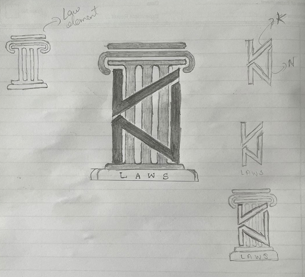
Law Pillar Shape: The core of the design mimics a traditional courtroom pillar, an enduring symbol of justice, structure, and strength. This immediately communicates the industry.
Integrated “K” and “N”: The top part of the pillar cleverly incorporates stylized segments of the letters “K” and “N.” The left stroke of “K” continues into the vertical structure of the pillar, while the “N” forms the finishing line of that same stroke, giving a clever illusion of continuity and unity.
LAWS Carved Text: The word “LAWS” is placed at the base of the pillar, as if engraved into its foundation — reinforcing the rooted identity of the firm and grounding the entire logo structure.
Color Story
#00416B Deep Legal Blue
/ 1
Symbolizes knowledge, trust, and authority. Serves as the foundation color.
#808080 Neutral Gray
/ 1
Adds a sophisticated, steadying contrast to the overall tone.
Typography Choices
Georgia
(Serif Typeface): Known for its strong, elegant letterforms, Georgia reflects tradition and dignity — perfect for law-related branding. It enhances the feeling of stability and commands respect while remaining approachable.
ABCDEFGHIJKLMNOPQRSTUVWXYZ
ABCDEFGHIJKLMNOPQRSTUVWXYZ
1234567890
Design Rationale
This logo achieves clarity, symbolism, and aesthetic coherence. The use of a law pillar serves as a direct visual anchor to the firm’s practice area, while the creative embedding of initials adds uniqueness and brand personality. The elegant serif type and the stable, subdued palette complete a professional and authoritative visual identity.
Whether placed on signage, letterheads, or digital materials, the logo stands firm — just like the values the firm represents.
Final Outcome
The final logo for KN LAWS functions as both a visual symbol and a brand statement. It reflects the gravity and tradition of the legal profession while presenting the firm’s identity in a fresh, distinguished manner.
It now serves as a powerful and trustworthy emblem across KN LAWS’ online presence, legal documents, client presentations, and more — standing tall, just like the law it upholds.