Integrity Law Chambers is a boutique law firm committed to upholding justice, transparency, and professionalism. With a clear focus on client advocacy and ethical practice, the firm provides reliable legal services while maintaining a foundation rooted in integrity.
Project Overview
The client approached us with a request for a minimalist logo that effectively represents the legal industry without visual clutter. The design needed to strike a balance between simplicity and symbolism, while delivering a strong and immediate association with the law.
Design Goals
Minimalism
Instant Recognition
Brand Strength
Typography-Centered Identity
Ideation
&
Sketching
Logo Concept & Symbolism
The final logo showcases strategic visual minimalism with deep symbolic meaning:
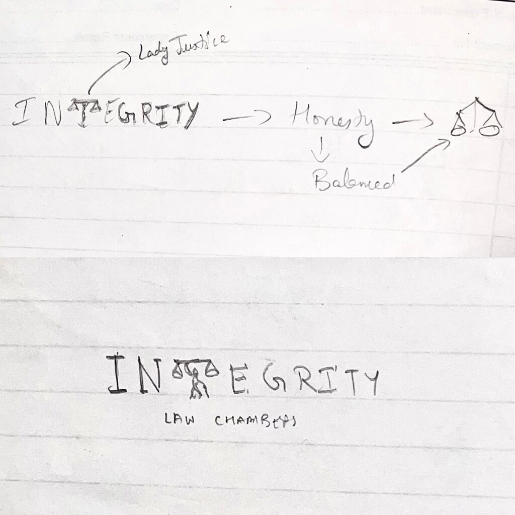
Custom “T” with Lady Justice Icon: The central design decision was replacing the letter “T” in “INTEGRITY” with a stylized Lady Justice holding the balance scale. The scales above her head subtly form the crossbar of the “T,” resulting in a seamless fusion of symbolism and typography.
Lady Justice Representation: A universal emblem of fairness, equality, and moral judgment, her presence solidifies the legal identity while supporting the brand name “Integrity.”
LAW CHAMBERS Label: Placed neatly below in a smaller font size, this clarifies the nature of the business and adds a finishing touch to the composition.
Color Story
#00274D Navy Blue
/ 1
Represents trust, authority, and depth — perfect for the legal field.
#000000 Black
/ 1
Emphasizes strength, clarity, and precision.
Typography Choices
Lora
(Primary Font): A modern serif that brings a classic feel with contemporary readability — ideal for emphasizing tradition, integrity, and confidence.
ABCDEFGHIJKLMNOPQRSTUVWXYZ
ABCDEFGHIJKLMNOPQRSTUVWXYZ
1234567890
Montserrat
(Secondary Font): A clean sans-serif that adds friendliness and accessibility while keeping a modern visual structure.
ABCDEFGHIJKLMNOPQRSTUVWXYZ
ABCDEFGHIJKLMNOPQRSTUVWXYZ
1234567890
Design Rationale
This logo is a prime example of how minimalist design can carry strong conceptual weight. By cleverly integrating the Lady Justice figure as a part of the text, it builds an immediate connection to the legal profession while maintaining brand sophistication.
The careful use of typography ensures high legibility and aesthetic appeal, while the elegant layout and restrained color palette maintain a timeless and authoritative tone.
Final Outcome
The Integrity Law Chambers logo is now consistently applied across the firm’s stationery, website, business cards, and digital communication. It successfully embodies the values of the brand — justice, clarity, and professionalism — while leaving a lasting impression through its clever minimalism.
This logo now stands as a strong visual symbol of legal integrity, reinforcing trust with every impression.