Narasimha Ventures is a construction company known for its bold, resilient approach to infrastructure development. With a focus on quality, precision, and strength, the firm draws inspiration from cultural heritage while embracing modern engineering practices. Their brand reflects reliability and fearless leadership in the construction space.
Project Overview
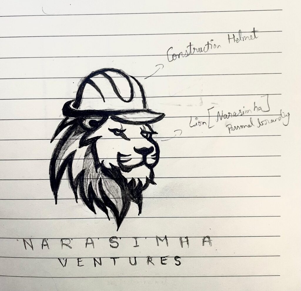
The client wanted a logo that blends their construction business with their powerful name — Narasimha, the fierce deity known for protection and strength. The logo was expected to embody boldness, dependability, and the robust nature of their construction work. The goal was to create a mark that is instantly recognizable and aligned with both traditional strength and modern craftsmanship.
Design Goals
Symbolic Power
Industry Relevance
Brand Identity
Visual Impact
Ideation
&
Sketching
Logo Concept & Symbolism
The final logo design combines potent symbolism with industry-specific cues:
Lion Face Icon: The central visual is a stylized lion face — representing the “Narasimha” persona. The lion reflects courage, protection, and leadership, echoing the brand’s fearless approach in the construction world.
Construction Helmet: Placed atop the lion, this element grounds the logo in its industrial context. It not only signifies the construction business but also symbolizes responsibility, safety, and professionalism — key traits of a trusted builder.
This fusion of cultural symbolism with industrial relevance creates a highly memorable and meaningful brand mark.
Color Story
#C0773E Burnt Orange
/ 1
Evokes a grounded, earthy tone that reflects stability and construction materials.
#4E342E Rich Brown
/ 1
Suggests strength, durability, and heritage.
#FFFFFF White
/ 1
Used in combination to balance darker tones and ensure readability.
#FFC107 Construction Yellow
/ 1
Represents energy, caution, and the industrial safety aspect.
#FDFDFD Pure White
/ 1
Provides clarity, openness, and contrast for cleaner visibility.
Typography Choices
Agency FB
(Primary Font): A bold, geometric typeface known for its tall, structured letterforms. It exudes confidence, strength, and formality — all crucial attributes for a construction brand. The clean lines of Agency FB ensure that the logo maintains a powerful presence across all mediums.
ABCDEFGHIJKLMNOPQRSTUVWXYZ
ABCDEFGHIJKLMNOPQRSTUVWXYZ
1234567890
Design Rationale
The Narasimha Ventures logo stands as a bold statement of identity. The lion face invokes power and heritage, while the construction helmet grounds the brand in its industry. The color palette reinforces this with a balanced mix of strength and warmth. Agency FB’s sharp typography ensures the brand name is communicated with clarity and impact.
The combination of cultural symbolism and modern functionality makes the logo visually arresting and deeply representative of the company’s values — strength, protection, and structure.
Final Outcome
The logo has been rolled out across site boards, uniforms, business cards, and corporate materials. It effectively represents the essence of Narasimha Ventures — commanding attention, earning trust, and communicating strength at every touchpoint.
With this new identity, Narasimha Ventures is positioned to build not just structures, but a legacy rooted in power, trust, and tradition.