Tarotsphere is a mystical tarot reading service offering intuitive guidance and spiritual clarity through powerful tarot experiences. Built on themes of cosmic connection, inner wisdom, and energetic alignment, the brand caters to seekers who yearn for deeper understanding and alignment with universal energies.
Project Overview
The client approached us with a vision of blending mythology, cosmic symbolism, and personalized identity into a singular brand mark. The logo needed to be spiritual, visually captivating, and meaningful—capturing the essence of mysticism while remaining grounded in intuitive storytelling.
Design Goals
Mystical Identity
Symbolic Depth
Balanced Composition
Personalized Connection
Ideation
&
Sketching
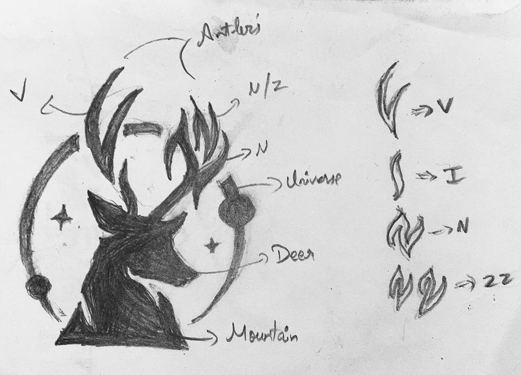
Logo Concept & Symbolism
The Tarotsphere logo is a deeply symbolic composition, fusing nature, astrology, and personal identity:
Deer Head: The central icon is a deer’s head, representing intuition, grace, and spiritual awareness. The deer is often seen as a messenger between earthly life and spiritual realms.
Mountain Base: Symbolizes grounding, inner strength, and life’s journey. It visually anchors the deer, suggesting that even spiritual insight must stand on personal growth and life experiences.
Circular Universe Backdrop: Behind the deer is a cosmic circle filled with stars and planetary elements, reinforcing the idea of tarot as a map of the universe. This layer reflects mystery, destiny, and astral guidance.
Antler Typography (VINZZ): The client’s name, VINZZ, is creatively embedded into the antlers. This symbolizes personal mastery and the power of self-identity within the spiritual journey. It adds a layer of uniqueness while preserving legibility and design integrity.
Primary Colours
#3D1E6D Mystic Purple
/ 1
A deep, spiritual shade symbolizing magic, inner wisdom, and depth of insight.
#D16BA5 Mystic Rose
/ 1
A mystical pink that evokes creativity, emotional healing, and spiritual beauty.
Secondary Colours
#FFFFFF White
/ 1
Signifies purity, clarity, and higher consciousness.
#C0C0C0 Silver
/ 1
A cosmic metallic that reflects lunar wisdom and subtle luxury.
#E0AA3E Golden Amber
/ 1
Brings warmth, enlightenment, and radiant energy into the design.
Typography Choices
Celestial Typeface
(Primary Font):
Celestial Typeface was selected for its mystical and ornamental nature, echoing the arcane aesthetic central to the brand:
The font delivers elegance, astral mysticism, and spiritual gravity—ideal for a brand rooted in tarot wisdom.
It complements the iconography and enhances the overall celestial visual identity.
ABCDEFGHIJKLMNOPQRSTUVWXYZ
ABCDEFGHIJKLMNOPQRSTUVWXYZ
1234567890
Design Rationale
The logo’s layered storytelling merges earthly grounding with astral elevation. By using the deer and mountain to represent guidance and inner strength, and backing them with a universe full of stars, the brand effectively positions itself as both a grounding presence and a cosmic gateway.
The antler-integrated typography is a masterstroke of personalization—it not only brands the service but also metaphorically places the client as the source of spiritual wisdom flowing outward to others.
The color palette, paired with the celestial typeface, brings the perfect aura of mystical professionalism, making Tarotsphere stand apart in the esoteric space.
Final Outcome
The final logo for Tarotsphere now functions as a magnetic visual identity across the brand’s digital presence, business cards, session materials, and social media. It elevates the brand into a realm of spiritual authority, trust, and intrigue.
This logo doesn’t just symbolize tarot — it embodies the journey of light, wisdom, and cosmic exploration that Tarotsphere offers.