VenPay is a digital payment platform designed to empower businesses with seamless, secure, and efficient financial transactions. As an all-in-one payment solution, VenPay streamlines business operations while building customer trust through intuitive technology and reliable support.
Project Overview
The client approached us with a clear vision — to create a modern and minimal logo that symbolizes unity, security, and the simplicity of their service. The identity needed to evoke trust and professionalism while remaining friendly and approachable to a wide audience of business owners and users.
Design Goals
Clarity & Simplicity
Symbolic Unity
Brand Initials
Trust & Professionalism
Ideation
&
Sketching
Logo Concept & Symbolism
The final logo brings together form and function with thoughtful execution:
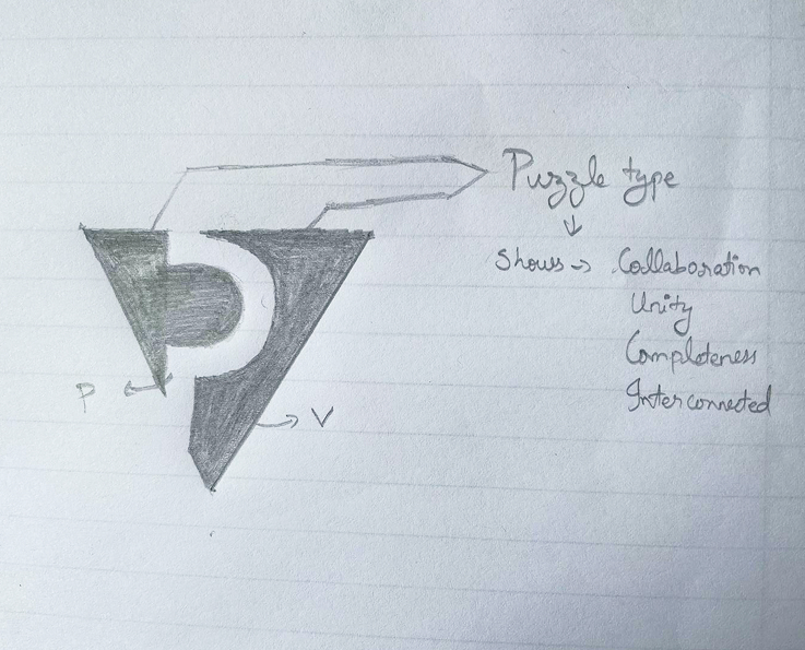
Puzzle-Like Form: The core of the logo features a “P” shape cut inside a “V”, symbolizing two pieces coming together in harmony — reflecting collaboration, trust, and the completeness of the VenPay platform.
Interconnection: The subtle puzzle feel illustrates how businesses and payments are interlinked within the VenPay system.
Initials Integration: Both “V” and “P,” the initials of the brand, are embedded in the symbol, creating a memorable and meaningful mark without clutter.
Color Story
#0175F0 to #01438A Gradient Blue
/ 1
These shades signify professionalism, trust, and digital innovation. The gradient adds visual depth and dynamism.
#FFFFFF White
/ 1
Complements the blue with a clean and minimal touch, reinforcing transparency and simplicity.
Typography Choices
Nunito (Regular)
(Primary Font):
A rounded sans-serif font that conveys friendliness, clarity, and precision. It brings a soft human touch to the overall identity while maintaining a clean, legible structure suitable for tech and financial platforms.
ABCDEFGHIJKLMNOPQRSTUVWXYZ
ABCDEFGHIJKLMNOPQRSTUVWXYZ
1234567890
Design Rationale
This logo is a balanced blend of geometry and subtle symbolism. The minimalist approach ensures high scalability and easy recognition across digital and print mediums. The intelligent integration of the “V” and “P” reflects thoughtful design while the puzzle-like fit reinforces the brand promise of unity, collaboration, and smooth operation.
The color gradient reinforces digital sophistication, while white space ensures clarity and focus.
VenPay
Final Outcome
The VenPay logo now serves as the visual foundation for the platform’s digital presence — from app icons and splash screens to marketing materials and business communications. It reflects a unified system built on trust, clarity, and innovation.
With this new identity, VenPay is well-positioned to grow its user base while strengthening the brand’s commitment to secure, efficient, and collaborative financial solutions.